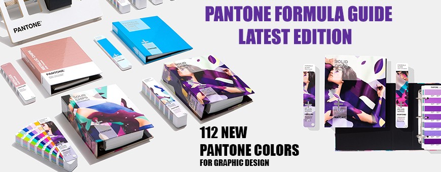
These PMS Color Charts from Design Info Will Dazzle Up with Pantone Solid Colors
Color is a common language in which people all over the globe communicate. One can be distracted or soothed with just a glance at a color or a group of colors. That’s why designers across the world have been trying to create ways in which different emotions can be visualized through colors, thus making color trends change every now and then. Because first impressions matter so much in today’s fast-paced world, one would do better to keep up with the latest color forecast trends as illustrated by PMS color shade charts. For instance, the spectrum of this year’s color trends ranges from tones that are bright and vibrant without being overpowering, to clean and subdued neutrals. Summer fashion embraces a design and color direction characterized by confidence and filled with creativity, as street style and high fashion join hands. Energizing and dynamic hues present with formulas in Pantone Guides are defined mostly in red, pink and yellow tones for both women’s and men’s fashion, while classic neutrals such as the timeless Brown Granite and the soft Sweet Corn provide a reliable foundation for dramatic color contrasts.
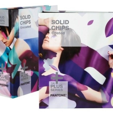
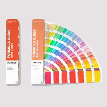
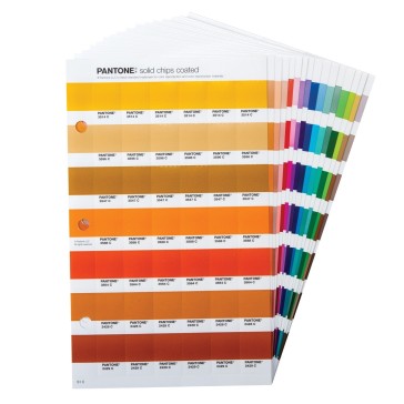
PMS has a variety of Color Charts
Vibrant, fiery reds evince the feeling of living on the edge and embolden one to face the future with positivity. Apart from blushing pinks which conjure up thoughts of romance and sentimentality, and cheerful yellows feeding one’s desire for pleasant comforts, summer fashion forecast color trends have also been inspired by Mother Nature herself, manifested not only in green tones that encourage one to think of healthy green foliage but also in a mellow, yet vibrant coral color that the Pantone Institute has pronounced as its Color of the Year – the Pantone 16-1546 Living Coral which is a Pantone Solid Color. Inspiring warmth and comfort, this coral color have a golden undertone that indicates one’s need for optimism along with playfulness more than ever in the busy world of today. Sitting amid a scale of red and pink, Living Coral highlights the underwater ecosystem of coral reefs characterized by fascinatingly colorful corals. The soft-edged but animated color was also featured on the runway for spring fashion, making the color trends for spring fashion transcend seasonality this year. Representing the fusion of the natural world with the modern life marked by social media presence, this affable shade can be identified as an ideal lipstick color.
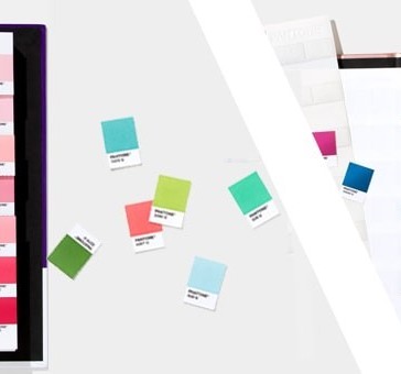
Print and Packaging Industry use PMS Colors for accuracy
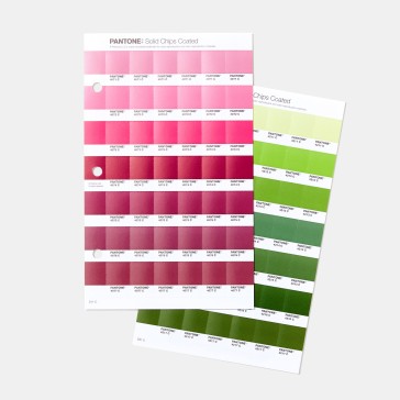
In a maximalist bedroom, Living Coral would jive well against teal or light blue, white with a straw bag and gold jewelry to match, the color completes the picture with finesse. Such summer fashion color trends are represented by Design Info’s Pantone PMS Solid Color Charts, which reflect not only the boldness but also the authenticity that this joyful combination of colors exudes. Meanwhile, PMS color guide charts for autumn and winter fashion statements this year exhibit a strong focus on the need for asserting one’s own personal identity. This need is realized through unique and sophisticated color palettes that exude an aura of empowerment and confidence. Relatable colors in blue, red, pink, and green tones enable one to select the color that’s best expressive of one’s moods and personality. For example, a classic, deep Evening Blue neutral is symbolic of a high level of confidence and makes for a perfect denim color, pairing off well with vertical stripes present in the solid chips of pantone. The deep, creamy yellow tones of Dark Cheddar and Butterscotch are truly autumnal shades which can make one look chic even during the coming cold season, while the bright-and-bold Orange Tiger, matched with equally bright pinks as well as subdued neutrals, adds a livelier touch to the mix of blues blending with grays.
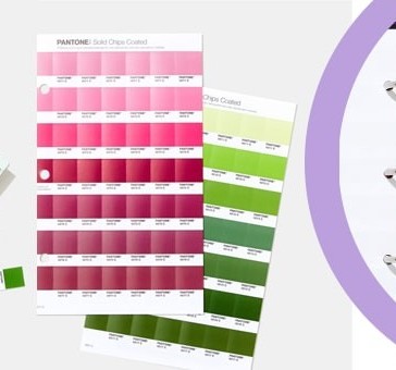
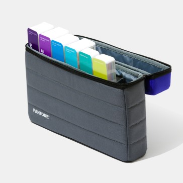
Summer and Winter Seasons have PMS options chosen from different Charts
Pantone Solid Coated Color guides for winter and autumn fashion, also signals a return to nature through earthy tones in greens and browns. The green shade of Guacamole and the dark green one of Forest Biome, for instance, are both perfect hues for fall fashion, with Eden’s forest green color being ideal for style statements during the cold season. Winter fashion will also be focusing on white neutrals, the cleanliness of which imparts a feeling of serenity as well as that of purity. Often associated with neutrality and honesty, white seems to be taking center stage this year, due to its calming effect and its centrality in a minimalist design. Such hues as the Pantone 15-1530 Peach Pink, a more muted variant of Living Coral that imparts a warm glow, the royal color of Pantone 19-4055 Galaxy Blue that motivates one to be thoughtful, and the sweet, nutty brown shade of Pantone 18-1155 Sugar Almond jiving well with animal prints, are built on the refreshing structure of stand-alone classic neutrals such as the creamy, off-white beige Pantone 12-0815 Vanilla Custard and an eternal Frost Gray conveying stability. When paired together, these color tones not only reveal a degree of warmth and versatility but also exist in perfect harmony with each other.
Why opt for Pantone Solid Colors for Designing?
Men’s and women’s fashion designers struggle to choose the right color trends that resonate with their styles, brands, and seasons.
Future of Solid Colors in the Pantone Industry
To stay ahead of the curve, you need to keep pace with trending colors served up on the runway at Paris, New York, London, and Milan fashion weeks by such big brand names as Stella McCartney, Chanel, Alexander McQueen, and Oscar de la Renta. For this, Design Info is always geared up to come to your aid. Design Info is a one-stop-shop for Pantone color shade cards representing the latest, along with the future color trends for summer, spring, autumn, and winter fashion, as well as pantone color guides that help guide you on the path towards creating relatable, accessible designs with head-turning colors.
Trendsetter books have colors in solid format.
In our trendsetting color books, such as the Pantone View Color Planner S/S & A/W, we at Design Info compile all the trends in color forecast with a DVD, thereby making the lives of all the fashion designers out there much easier. Our experience of working with a huge network of graphic designers and textile designers for 45 years has made Design Info Asia’s largest supplier of fashion forecast magazines. For next-gen color trends, choose Design Info.
![Pantone Formula Guide Solid Coated & Uncoated GP1601A Book [2022 Edition]](https://www.designinfo.in/wp-content/uploads/nc/p/1/6/2/4/4/16244-364x364-optimized.jpg)
![Pantone Solid Chips & Guide Set Coated & Uncoated GP1606A [2022 Edition]](https://www.designinfo.in/wp-content/uploads/nc/p/1/6/0/8/6/16086-364x364-optimized.jpg)
![Pantone Color Book Coated & Uncoated Set GP1601A [2022 Edition]](https://www.designinfo.in/wp-content/uploads/nc/p/1/7/1/7/4/17174-364x364-optimized.jpg)
![Pantone Formula Guide Supplement | Coated & Uncoated [2022 Edition] GP1601A-SUPL](https://www.designinfo.in/wp-content/uploads/nc/p/1/6/5/0/2/16502-364x364-optimized.jpg)
![Pantone Color Chart Solid Coated & Uncoated GP1601A Book [2022 Edition]](https://www.designinfo.in/wp-content/uploads/nc/p/1/7/1/7/8/17178-364x364-optimized.jpg)
![Pantone Solid Chips Coated & Uncoated Book GP1606A [2022 Edition]](https://www.designinfo.in/wp-content/uploads/nc/p/1/6/2/4/8/16248-364x364-optimized.jpg)