Discount
Same Day Shipping EMI & COD on most products
Trusted Partner Since 1969
GST B2B Billing     Design Info Help Icon Hader Help     WhatsApp Icon Header 00919699976817

RGB Process

Filter by price
Brands
RGB Process

Showing all 16 results

RGB to Pantone | Process Color Book

Understand the difference between Pantone PMS Spot colors and the CMYK / RGB system of printing to take better decisions in purchasing the right Pantone process book for printing. Explore the latest process color book for printers and inkjet service providers.
Colour Accuracy with Pantone – Explaining Spot & Process Colors in Detail
Colour plays an important role in the design. It gives it a character, assists the viewers to associate with the design, represents relevant themes and gives a basic identity to objects. The colours have a variety of shades based on saturation and light and are effectively incorporated to help customers relate to the object. Since colours have been formulated for different platforms it is imperative that the colour the designer has in mind is what is printed on the surface. Pantone has been the effective medium of communication allowing the designers to access a plethora of colours that can be incorporated in the specific industry. The Pantone shade cards have been utilised as a global language that can help consumers from all over the world use the same terms for a specific colour.
Different Colour Formulating System – PMS vs RGB vs CMYK Colors
Pantone has assisted in bringing the conceptual idea of the colour to life by giving an accurate identity to each shade. The output and the final colour must match what the design states. Each medium uses a different colour system formulated in a different manner. Following mentions the 3 colour modules that are utilised to create a design, from the initial selection of colours to designing to the final printing process.

PMS – the Pantone Matching System is an internationally accepted language helping the designers communicate with the manufacturers about the precise shade they need. With a variety of industry-specific shade cards made available by Pantone, the colours found to enhance the aesthetics of the particular products. With a cascade of shades, the designers can incorporate them with their innovations.
RGB – The RGB colour module is used on digital electronic screens. The primary colours – red, green and blue are used to create a variety of shades that can be incorporated in creating digital designs. The combination of these three colours are used to create a broad spectrum of colours and its various shades. From creating black with zero intensity to white with the addition of extreme or full intensity, the RBG system can create a mammoth spectrum of colours. In terms of web-designs, RBG has over 16 million colours available through the TML codes and 216 webspace colours.
CMYK –  This colour module is universally accepted and used primary colours used for printing. CMYK is the suffix for Cyan, Magenta, Yellow and Black. This method formulates colours by combining these shades to create an endless option of colours that are used for printing. 

The Pantone Color Bridge Uncoated & Coated Guide have PMS, RGB and CMYK colors comobinations with formulations present. This is the main advantage over the regular Pantone Formula Guide.
What exactly are Spot Colours?
There are about 18 base colours the spot colours are created by the Pantone Matching System (PMS) with a unique ink mix that is formulated to create a vast variety of colours. The spot colours or solid colours are created to assure that the mixing of colours gives precision and accuracy in shades. Compared to the CMYK or RGB, the PMS formulates colours with the help of 18 colours that give a brighter and cleaner look to the outcome. Along with its vibrancy, spot colours are used to provide consistency with each production of the same shade.
What are Process Colours?
The process colours are created by CMYK colours and are predominantly used in printing. With these four base colours, the printing technology combines these shades to create the colours that are seen on the screen. The process colours are developed as percentages of the four base colours and the variations of colour percentage formulated and create new shades. The CMYK colours are the basic foundation of process colours that allow printing of the designs on a wide colour spectrum to take place.
Difference between Pantone Spot and Process colours
The creation of colours and its various shades are done by different methods making spot and process colours differently. The spot colours utilise 18 base colours whereas process colours only 4. This makes the most difference in the final product and makes Spot colours more vibrant and bright. To avoid disappointment with the outcome of the printed colour, there is a gap which needs to be bridged between these two processes. Spot colour is utilised by PMS and process colours are created with CMYK in printing, thus there is an impending need to bring symbiosis between PMS and CMYK. Pantone Color Bridge Coated Guide has side by side display of colors to give an actual feel after printing, therefore saving several hours of printing and testing.
Bridging the Colours between PMS and Pantone CMYK Printing
Since all these three modules are involved in every step of creating a design. The colour is chosen, the shades used in designing and the printed product should all have the same colour. Since there are three colour systems involved, that are formulated with different processes, a change in colour and shade is bound to happen. The colour change from start to finish has become apparent within the industries and there is an impending need to bridge the gap between the systems. Pantone has taken up the initiative of developing a universal bridge that syncs the shades of these formulated by the colour systems. The following are the guides created by Pantone that bridge the gap and give optimum colour satisfaction.
Pantone Colour Bridge Coated Guide
This Pantone colour bridge is a coated guide that acts as a tool for designers. It allows the buyers to visualise how the corresponding spot colour will look like when it is printed with the help of the four colour CMYK system. This guide consists of 2139 colours that are displayed in a manner that is easy for comparison. The PMS created shades are printed on one side and the correspondent colour from the CMYK colour system is placed right next to it allowing the buyers to know what the outcome will be like.
Pantone CMYK Guide Coated and Uncoated Colours
This PULS SERIES pantone cmyk guide is the ideal guide for all designers and includes both coated and uncoated papers. The Pantone CMYK guide has everything that a designer needs from a colour matching system that also provides essential data to visualise the printed outcome. This guide is a source for colour inspiration which assists the designers to create innovations on the basis of a wide spectrum of colours that can be ideal for the product or the decided theme. This guide consists of 2,868 Pantone and CMYK colours and which consists of additional colours in comparison to the 1,755 colours available with the other Pantone matching colour charts. Like any Pantone colour referencing and matching chart, the Pantone CMYK guide is a mode of communication that assists the designers, printers and manufacturers communicate and be on the same page while deciphering the colours. Considered to be one of the best guide, it also provides added assistance to the designers by giving the 4 colour combinations to each of the colours. All the colours are chromatically arranged and the CMYK colour combinations are stated below each colour. With several benefits, this guide has long term benefits and encompasses all the relevant information a designer needs while using colours.
 

  • How many colors are there in Pantone CMYK Book?

    There are 2868 colors in the Pantone CMYK Color Guide and they have the actual CMYK formulation of the colors present in them.

  • Which is more advanced - Pantone Formula Guide or Pantone Color Bridge?

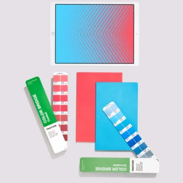
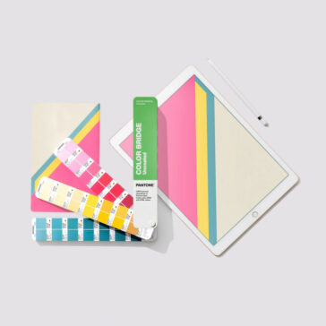
    There is absolutely no doubt that the Pantone Color Bridge Coated & Uncoated Guide Book set is a more futuristic guide meant for exporters and graphic designers to work in a seamless manner and has several advantages over the digital designers Formula Guide which is limited to the PMS colors only.

  • Is there a price different between different process color pantone books?

    Yes different Pantone guides are priced according to their usage and the color bridge series are the most expesnive given their sheer multi application over color guides with single color formulations.