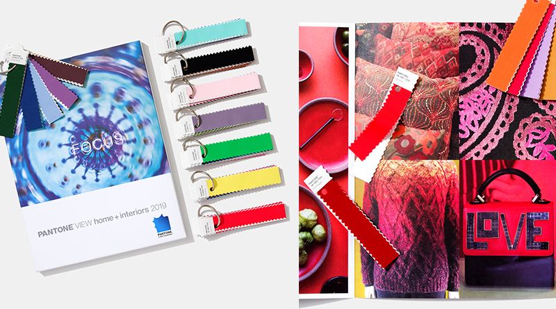
Pastels & Neon Nostalgia
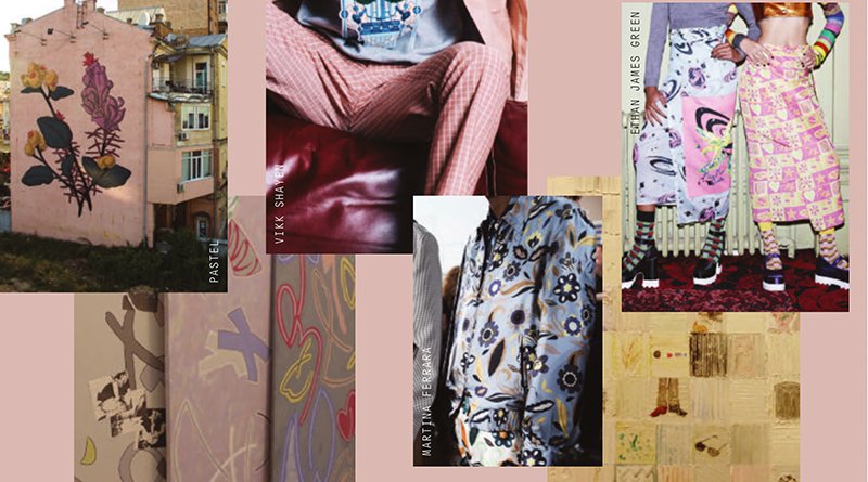
SOURCE Street artist ‘Pastel’s stylised floral murals painted on faded exteriors and the playful mark-making of artist Marc Camille Chaimowicz, as seen at Frieze London this year, evoke a childlike aesthetic that centres around a playfully applied and somewhat naïve graphic handwriting. COLOUR New pastel combinations are found in updated takes on the rose and […]
Easter Craft – Zeb Basics and Calming Neutrals Casual Wear Fabrics
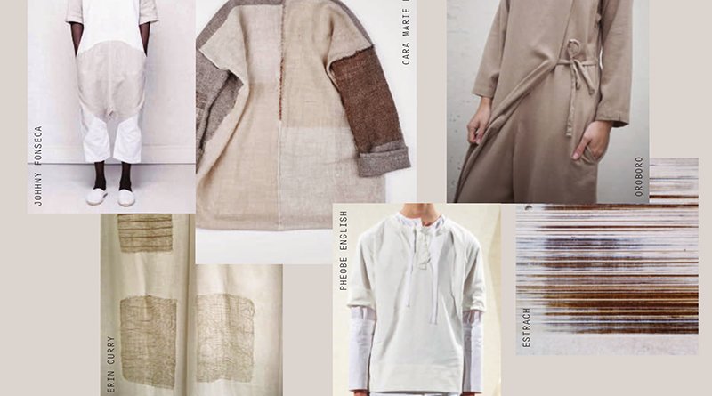
SOURCE Inspired by an emerging renaissance of hand crafting techniques, particularly of Eastern crafts such as bookbinding and origami, we are drawn to a calming and authentic aesthetic created by textilebased artists such as Erin Curry. COLOUR These are the new neutrals. A Zen palette of off-whites, sand and barely there blue, layered in calming […]
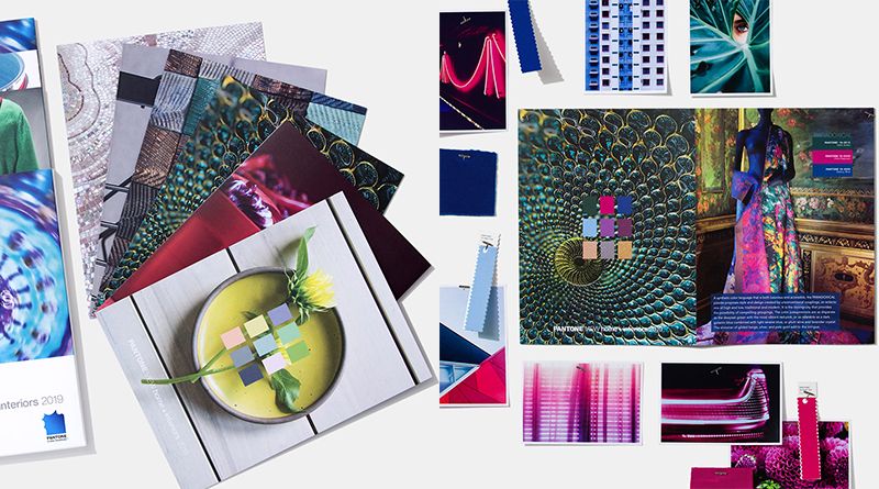
Gradient Colour System – Transformative Effect of Colour to Manipulate Perceptions
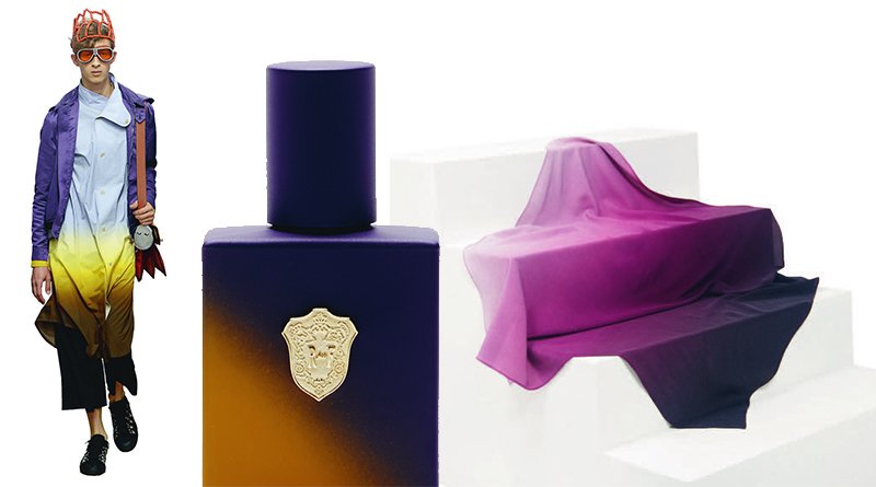
Designers are using the transformative effect of colour to manipulate perceptions of shape and form. Ombré effects applied to solid objects give them an ethereal quality while subtle gradients serve to enhance angles and form. 1. OFFROUND HUE BY SABINE MARCELIS AND BRIT VAN NERVEN FOR ETAGE PROJECTS Offround Hue is the latest addition to the Seeing Glass […]
Outstanding Colors within Colors, Standards You must Use
Why do we find the Sunset so magnificent? Have we ever thought about it that why does a field of green grass calms us down and we feel peace within? It is the magic of color, my friends. Colors play an essential role in our lives and we are too busy to stop and think about […]
Significance of Different Colors and their Meanings
The usage of Pantone solid colours in graphic designing can be a highly subjective topic of discussion. This is very simple to understand. A colour scheme that may seem magical to you, may not hold much significance for someone else. It is absolutely a matter of personal taste and preference, and on many occasions, determined by the […]
5 Ways How Interiors Designers can Maximise Output with Colors
For a head-to-toe design, the very first step is selecting a color palette. Interior designers face challenges to come up with a basic color scheme for the whole house. If you truly love a particular interior decoration, we bet that it’s because of the selection of colors. A well-planned space can be enhanced using efficient […]
Best Fashionable Color Options with Pantone System
Are you confused about determining which color will best suit your home or office or other structures? If you are, then make a stronger impression of your choice and bring Pantone Bangalore to your home or office environment. Pantone is one of the standardized color matching systems that help you in choosing different colors for different space of your […]


