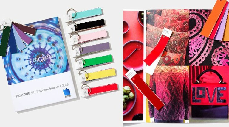
The usage of Pantone solid colours in graphic designing can be a highly subjective topic of discussion. This is very simple to understand. A colour scheme that may seem magical to you, may not hold much significance for someone else. It is absolutely a matter of personal taste and preference, and on many occasions, determined by the culture and civilisation that the person belongs to. Colour may mean a lot and a little change here and there in the hue can make a world of difference to a creation, whatever that might be.
Let us now understand how colour schemes and theory of colours can affect the way designers work and express their creativity.
What are Cool Colours and How They Influence Graphic Designing
These are the subdued tints and include:
• Green – the colour of nature
• Purple – the colour of night time
• Blue – the colour of water.
These colours are by character soothing, evoking relaxation and are sombre and grave. Blue being the only primary colour in this group, the other cool colours are nothing but a combination of blue with any one of the warm colours, that we will discuss shortly. To be more precise, you will get green by combining blue with yellow, and purple by mixing red with blue. While working on a graphic design, you can make use of various shades of these cool colours to signify serenity and seriousness.
What Are Warm Colours and What Are Their Significances
The hues included in this category, include:
• Yellow – the colour of sunset and sunrise
• Red – the colour of fire
• Orange – the colour of leaves during the fall season
These colours primarily demarcate positive energy, love and passion. Since both red and yellow are primary colours, and orange is created by varying the intensity of either red or yellow, then it implies that the warm colours are purely warm and have a co-mixed proportion of cool hues. While working on a design, you may make use of these warm colours to express positive energy, joy, love and guilt.
What are Neutral Colours and How Can They be Used
Designers often use neutral colours to build the backgrounds. They can bring about a special effect if used in complement to some bright colours. For some, only the use of these soft colours all by themselves can lead to a degree of sophistication and elegance not expressed in any other way. Neutral colours are influenced by and can influence to a great extent, the colours that appear around them. Some of the most significant neutral colours include:
• White
• Black
• Brown
• Gray
• Tan/ Beige
• Ivory/cream and so on.
A Brief Study of Some Important Colours
Red
It is a primary colour with a lot of warmth.
Its association is mainly made with warfare, fire and anger.
Red has a real and very physical effect on effect on the physical and psychological aspects of human beings.
Green
It is a cool secondary colour.
Green depicts simplicity and smooth.
It also means prosperity, growth and newness
But again green may also signify inexperience and rawness.
Black
It is very strong neutral colour.
Black is associated with formal designs, strength and exuberance.
There is a negative hue of black that points to death and mourning, as well as occult powers.
White
White, a neutral colour, is actually the presence of all colours.
It is the opposite of black and can be made to mix with any colour to bring about a new shade.
White may mean purity, virtue and cleanliness, and is also the colour of the saints and angels.
Colours are the best ways to express moods and meanings in the graphic designs. They can make you understand the feelings and the taste of the designer and can go a long way in helping you understand the character of the design and the designer in question.


