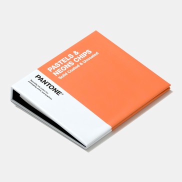
Pantone Pastel Color Shades | Official Pantone Neon Books Partner
Pantone Pastel and Neon
The Pantone pastelcolour books and Pantone neon colour charts are a colour matching system that consists of a barrage of pastel and neon colours that are curated to be in sync with the contemporary trends. The Pantone swatches available come in three portable casings and light making it a more user-friendly organised reference chart.
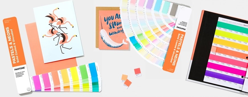
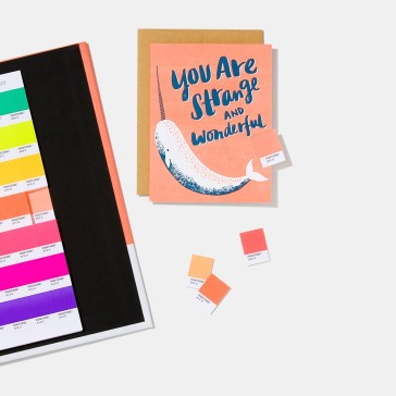
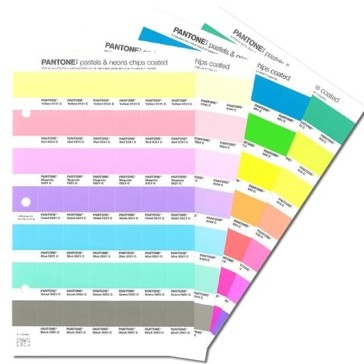
The Pantone pastel colours and Pantone neon colour books are available in the form of chips. These are coated and uncoated and come in removable chips that can be attached to other surfaces. With the well-organised colour matching system, the book provides 154 shades of pastels and 56 neon colours that can be incorporated on a variety of surfaces. This Pantone pastel and neon can be used on mood boards, digital pallets and have a three-sided colour bleed which gives accurate colours for the matching system. Created with spot colours, once the customer does order Pantone swatches,they come across the most precise form of colour matching ink which once utilised gives a high quality of colour results. These colours can be used for logos, packaging goods and spot colour printing.
The Influence of Pantone pastel and neon
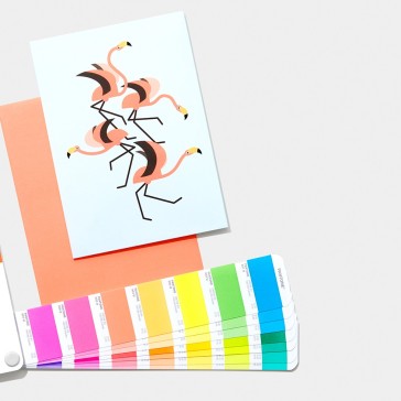
Colours play an important role in a person’s life and have a psychological influence on the viewer. It allows the viewers to correlate objects, themes, notions to certain colours. The play on psychology is been utilised by several brands and marketing companies helping the viewers associate things with the help of colours. Colours act as a stimulus to a certain emotion and Pantone pastel shades create a vivid and vibrant reminder to all things related to having fun and evokes brings a bright yet calming emotion. As the Pantone pastel shades have been created in a manner that they contain lesser saturation giving the light and calming effect. The Pantone pastel colours are widely used as trends during the summer spring season and the various shades represent the feeling of summer. With close association and similarities to earthy shades, pastel shades are all about to remind the viewers about the natural beauty. Neon Pantone colours are associated with frivolity as well as a form of warnings. As commonly seen neon colours are also a form of indications to be seen in the dark. With a classical use of being adorned on high visibility jackets or indicators for road and traffic safety. Neon Pantone colours have now been used in apparels, packaging’s, logos, marketing materials and other digital graphic designing. In the textile industry, all fabrics are dyed as per the designs that are synced with contemporary colour trends. Pantone neon brings emphasis and ensures that the viewers have a highlighted view with the help of these bright colours.
Pantone Pastels and Pantone neon shade cards
Pantone has created two kinds of databases that include the various Pantone pastels and Pantone neon colours. It is an essential guide that provides a plethora of shades that can be utilised for spot printing giving the exact same replica and precision of colour.
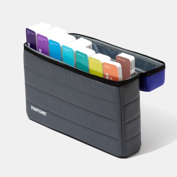
Packaging and logos both require the same printing output every time. It is imperative that these products have maximum precision of colour so that the consumers can identify with it. The spot colour shades which is provided by the Pantone pastel shade card and the Pantone neon colour books assures consistency within its output. The Pantone pastel colour books and neon colours also come in two different casings. Each of the products are created for optimal use of the buyers assuring they get the most of it.
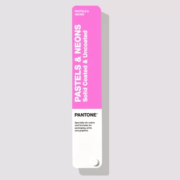
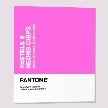
The Pantone pastels and neon guide comes in the form of a chip book and a fan-like opening casing. The pastel chip book comes with removable chips for each shade and the replacement pages for the chips can be also bought online. With a fan-like opening which is portable and light and easy to match, they can also buy Pantone swatches in the form of replacement pages. The replacement pages are available for the PANTONE PLUS SERIES chip books
Pantone aims to inspire and create a consistent matching system, the Pantone Pastel shade cards and the Pantone neon shade cards are available in a chromatic manner making it easier to locate the shades. This also makes it possible to see all the variable shades within one colour, allowing the designers to make a sound decision about the colour choice. The manner or displaying also allows the user to visualise colour combinations that can be incorporated. With these shade cards, the buyers get to access a plethora of choices and can communicate with others about the colour in concern with complete ease. Each colour has been given distinct identities with defined names.
What makes Pantone Pastels unique in the design world?
Pantone Pastels stand out due to their dynamic and fresh vibrance. Unlike regular shades, they possess an energy that resonates with the current generation. Their consistency ensures that designers achieve the exact shade they desire, making them a favorite in the design community.
How do Pantone Pastels influence emotions?
Colors have a profound psychological impact. Pantone Pastels, with their calming and sophisticated hues, evoke feelings of tranquility and relaxation. Their soft tones can create a serene environment, making them ideal for spaces meant for relaxation.
Why are Pantone Pastels preferred for brand logos?
Pantone Pastels have emerged as trendy colors in recent years. Their contemporary appeal, combined with the consistency offered by Pantone, makes them a top choice for brands aiming to resonate with a younger demographic while maintaining brand consistency.
How do Pantone Pastels ensure consistency in design?
Pantone, as a global authority on color, offers a standardized color matching system. When designers choose a Pantone Pastel, they can be assured of getting the exact shade they picked, ensuring consistent representation across various platforms.