Pantone Blue | List of Blue Pantone Shades with Color Reference
Pantone Blue
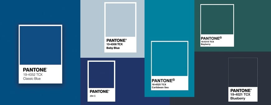
Pantone is known for its vast spectrum of colours and is considered the King when it comes to colours. Being the ultimate authority of colours and its multitude of shades, the Pantone shade cards are referred to on a global scale. Within the blue palate itself, several shades are created by amalgamating different parent colours. The Classic Blue has been selected as 2020’s Pantone colour of the year. After much research each year a colour is selected that is forecasted to be the new trend. Since each colour signifies a different meaning, the colour is selected based on contemporary notions and art as well. As each colour and its various shades have distinct identities and concepts attached to it, we furthermore we throw light upon the different shades of blue.
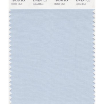
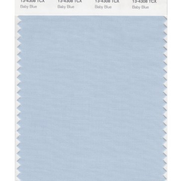
Pantone Baby Blue
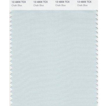
Pantone Baby Blue is a light shade of blue and has the notion of positivity attached to it. A light shade that belongs to the pastel family is considered to be a delicate colour. In the 19th century, this shade of blue was referred to a boy child and during that time this shade was more gender-specific. With evolving times, this pastel shade of blue is utilised as a unisex colour that is adorned by both men and women. Baby blue signifies simplicity and calmness.
Pantone Blueberry Blue
A darker shade of blue which derives its name from the fruit. This shade of blue is related to dependability and gives a professional outlook. This colour can be used in packaging as it has the connotation of trust attached to it. A colour plays an integral role in the brand identity and also becomes a symbol that can trigger the memory attached to the brand or the products.
Pantone Bayberry Blue Shade
Similar to a turquoise shade, this shade of blue has a hint of green imparted to it. It is a softer tone and gives a feeling of serenity and natural beauty. The Bayberry shade is exceedingly popular within the fashion industry and is seen as a tropical hue that can be used especially in resortwear. The colour symbolises creativity and has also made its way into activewear and swimwear apparels.
Pantone 294 C or Dodger Blue
This shade of Pantone Blue a become to be called Dodger Blue as it is now has become the official representation of the team. It has been adopted as the colour that is adorned by Dodger fans on a global spectrum and unties them all together because of this colour. This is a great example of the fact how colours have a psychological impact on its viewers and have the power to trigger memories. In this case, it gives close association to a sports team and is now become its symbol of recognition as Pantone 294 is the official shade of blue used by Dodgers.
Pantone Caribbean Sea Colors
Inspired the blue water bodies, the Caribbean Sea is a blue shade that is light and bright. It brings out positivity and happiness as symbolisms. This colour is predominantly used in the textile industry and can be used for interior decorations, home décor and even in the fashion industry.
How many shades of Pantone Blue are released and live?
There are about 250 different shade of blue released till date by Pantone and each year about 20 new blue colors are launched.
Are the blue shades different in paper and fabric?
There is about 22% difference after colors are dyes in fabric vs coated on paper.