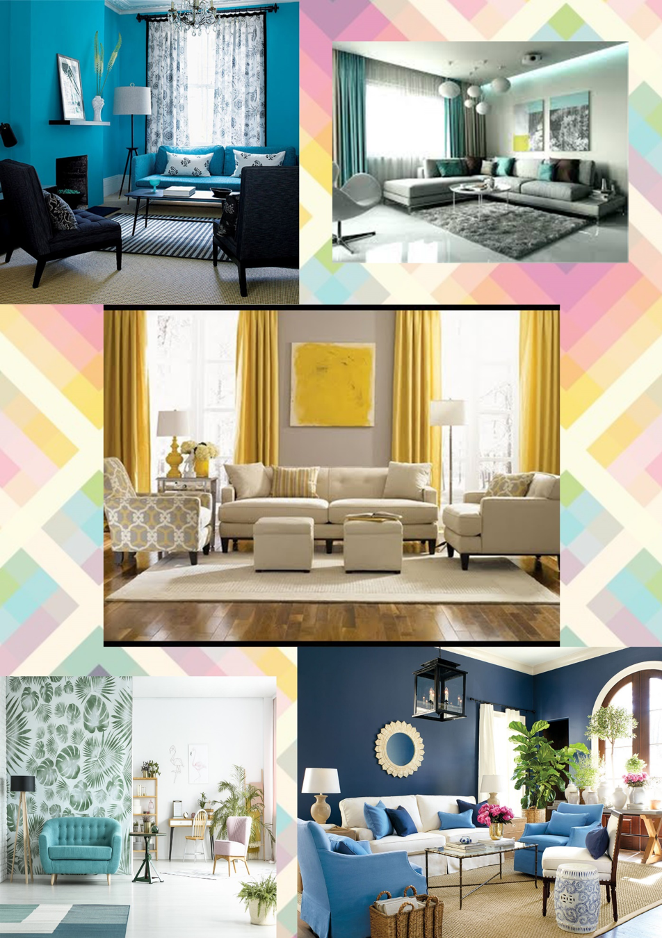
“Pick what you like because living with a trend that is not you is never a good choice.”
Happiness in-home products never goes out of style and it looks like fun, whimsical art and décor isn’t going away anytime soon either. Color experts Pantone in home furnishing and Interior decoration are always looking ahead and selected two key color palettes specifically for housewares and interior design for the new season.
Must-Have Pantone Shade Books for Home Interiors
Hitting the mainstream across natural homes, natural fabrics are becoming key to the conversation when considering interiors. Stepping away from the tech-obsessed décor trend that we saw dominate the old design trends, new trends move towards fresh, natural materials such as stones, copper, concrete, and granite dominant in Pantone TCX Books of the industry.
Unlike pantone color trends, new era is taking a more mindful, lifestyle- based approach to the development of new shades. Most paint brands have released their color of the year including- Coral pinks, Sea blues, Coral + Turquoise, Dark greens, Peach, and many more. Among them all we’ve some really interesting and motivational color combinations that will surely make all interior designers fall over every bit.
Pantone Colors of special mention in Interior Industry
Sailor Blue (#00203FFF) and Mint (#ADEFD1FF) TCX Pantone
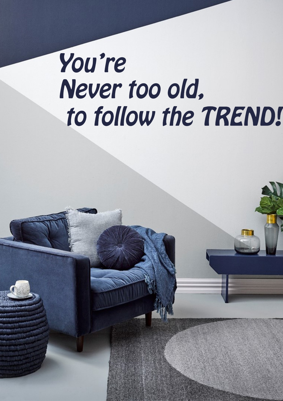
This is very surprisingly cool color combination because it is unexpected. This sorbet mint is fresh, zingy and very much on- trend. Pantone Pastel Shades have been prominent for sometime now and show no signs of diminishing. The inky navy color is deep, rich and almost masculine.
When they converge the result is elegant. Technically the colors should conflict but in reality the subdued rich navy offers a solid base for the vivacious mint. This palette would look wonderful when used as a bedroom or living room scheme.
Cherry Tomato (#ED2B33FF) and Rapture Rose (#D85A7FFF)
Another combination that catches eye of almost everyone is this tomato red and dusky pink. This twosome is successful because neither are vying for attention. They are close in terms of saturation- or in non-designer jargon- the shade of intensity. If either, or both, were brighter they would clash. Red and pink are also monochromatic color scheme which makes for a complementary palette.
The beauty of this particular pair is that the two individual shades are cool and modern.
Black (#101820FF) and Blazing Yellow(#FEE715FF)
Probably one of the most common contrasting color combinations, black and yellow is used in so many different situations. Yellow has been known to stimulate mental activity and when combined with depth of black, it’s ideal for creating a contrast that makes things easy to read and easy to understand.
Space Cherry (#990011FF) and White (#FCF6F5FF)
A pearly white plays off deep red of Space Cherry in stunning fashion. It’s no coincidence that red and white is a standard color combination for a wide array of sports teams and businesses.
It could look so amazing when used on walls of your house, where the white gains an added radiance alongside the cherry red walls. This colors can be found in the TPG Books of Pantone in several formats for matching.
The white gives the strong and stimulating red some balance and adds a touch of lightness to it.
Warm Gray (#A59C94FF), Crimson (#AE0E36FF) and Raspberry (#D32E5EFF)
The words ‘warm’ and ‘gray’ are not the ones that you would typically associate with each other, but when unique Warm Gray defies the rules.
There’s nearly a hint of brown lurking behind the darker exterior and this results in a gray that is far more welcoming and amiable than usual.
Crimson and Raspberry enhance the Warm Gray with their vivacious colorations. When seen together, the trio are one of the most cultivated color combinations.
At some point, we’ve all been in a place where we cannot choose the best paint colors to combine with your interiors and how to use them to your advantage. But, Woah! Design Info provides you the best guides. It makes you think in a way far from what you might have thought. We’re looking at trending interior paint colors to get you inspired. From which paint colors will work best in which room throughout your home to paint color ideas for the accent walls in an innovative way.


