Colour is a characteristic of human visual perception, is something that Google says. But before anything else, colour is an emotion! Once humans identify a colour, it instantly triggers a chemical reaction in the brain that generates an emotional response. Right from waking up in the morning to going to bed again, our eyes visualize so many hues of colours in different product designs! Interesting and Shocking at the time is the fact that even though there are thousands of hues that we witness every day, there are millions more that we haven’t yet!
Having already mentioned the enormity of colours, it won’t be objectionable to state that colours play a vitally important role in a way we project ourselves. Colours can sway thoughts, affect actions, and the list can be inexhaustible. The science of how colours influence us is at least 200 years old.
How to choose the right colors of Pantone Color Shade Cards in product designing?
Now since we have agreed how important colours are, it wouldn’t be dubious to say that they reflect our personality. Colours are a powerful form of communication. Red conveys danger, eagerness, enthusiasm, and passion. Blue represents peace, trust, and so on. If you use yellow, you’re personifying cheerfulness, optimism, playfulness, whereas black represents luxury, despair, formal and sophistication. Pink is feminine, romantic, emotional. Every colour has a story to tell, and which story you want to depict depends on how efficiently you choose your tints.
Presently, the importance of pantone colours and pantone colour physiology in product designing is being hugely accepted in businesses in regards to branding and packaging. In this world of the immense amount of options, what can help you stand out is the use of colours. The way people identify your brand is with colours. It is not only convenient but also effective. The colour of your brand is an essential character for your brand story. Imagine a red can of cola, a black apple, white bold text on red stripe, weren’t you able to identify the brands? Colours allow us to instantly identify and draw emotional associations to a brand.
Choosing Right Colours for Your Brand
Knowing the Target Audience:

Before delving into the process of the actual job, research is a crucial element. It’s necessary to understand the psychology of the audience you’re targeting at. Their age, status, gender, qualification, needs, etc helps to evaluate the probable mindset your potential customers possesses. All these factors play a noticeable role in deciding the colour your brand and packaging should have.
Your Brand’s message and its coherence with colors

Knowing what your brand caters and the idea behind it could be a vital inspiration in handpicking the colour. The tone and voice of the brand; bold, blunt, soft, mild, cheerful, luxury, etc are the factors that should be considered.
Finding the Culture Needed
Different regions follow different cultures. Hence, the meaning and the symbolization of colours also vary with geography. For example, in the US, white represents purity while in some Asian regions; it is the colour of lament. Hence, being aware of the culture you’re catering to provides access to infiltrate the region as well as the psychology of the consumers appropriately. thus choosing right color shade hues in different pantone shade cards is important.
Experiment with different Pantone Shades
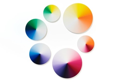
Considering all the factors mentioned, it is, however, important to experiment in order to stand out. Different colours can have very different impacts on different consumers. It is advisable to experiment with at least three options to ensure that you find an appropriate and powerful palette.
Finding the Mood Board of the target market
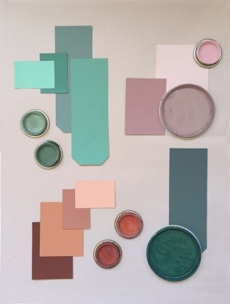
Experimenting with different colour palettes to determine the mood it evokes could also be useful in choosing the right colour for your brand. The same can be done with the help of colour pick tool as well as gradient pantone color book cards. Placing multiple colours together will provide you with ideas regarding different moods and emotions that your brand evokes.
Trend updates in the Color Industry:

Being up to date in regards to colour trends helps to a great extent in deciding mindfully as well as keeping up with the contemporary demands. It helps in the portrayal of your brand as current, which is important to connect to the newer potential customer base. This can be done with various trend forecast books articles and references on the move.
However, the bottom line that should be remembered is that playing with colours isn’t something that should be practised merely because it might seem cool, contemporary or because everyone is following that. It is very crucial to comprehend that choosing the right colours to fit and replicate the authenticity of your brand is not an easy job, especially with massive and diverse options available. Properly chosen colours define your brand value, positioning, recall value and personality of the brand. This is something that shouldn’t be underestimated. If you’re someone looking for a helping hand in picking the relevant colour for your brand and packaging, you can try visiting ‘Design Info.’ They have not only covered the guides for various different colours, but also in current trends forecasts, logos, graphics, prints and patterns.